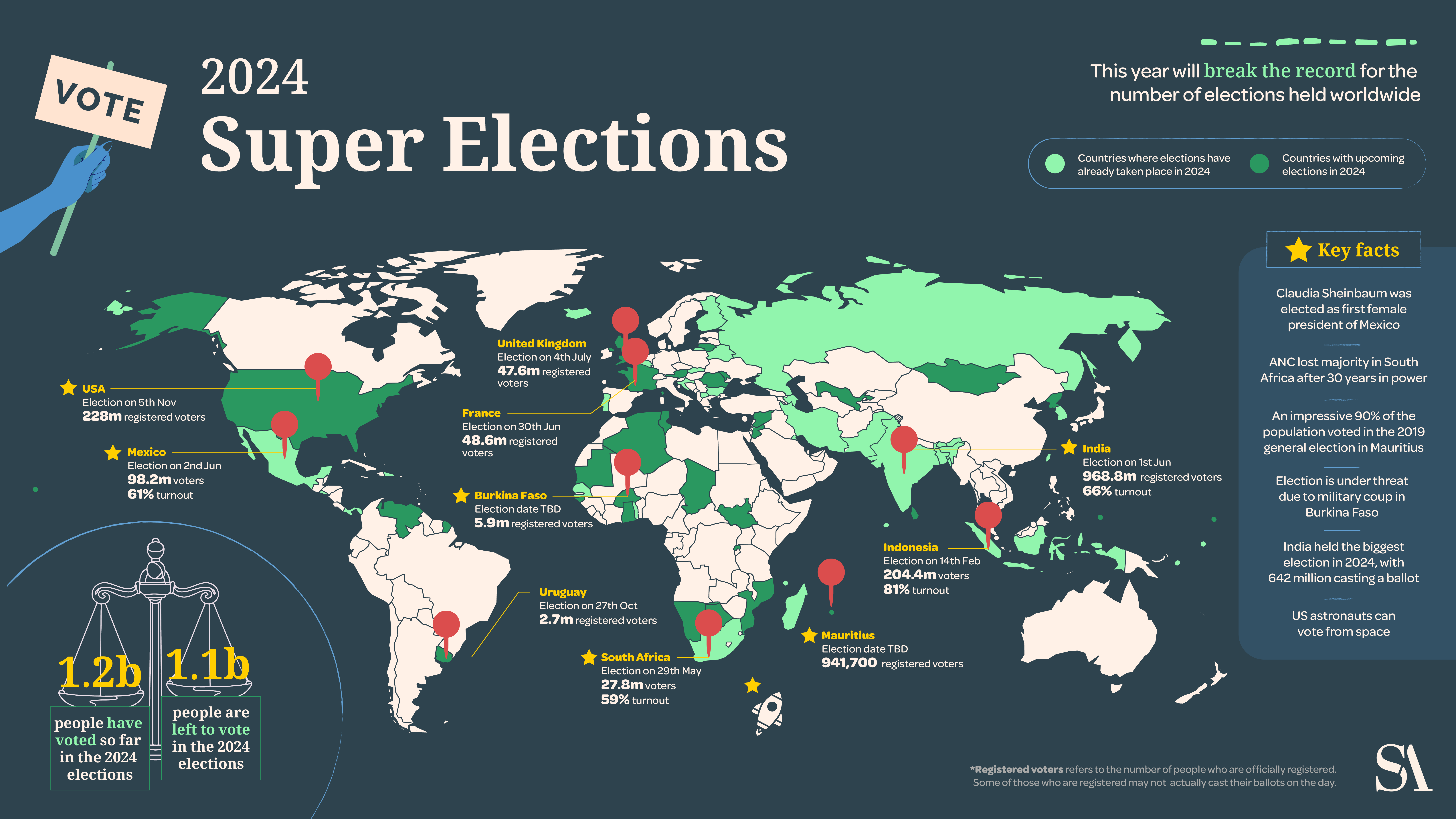
Data Visualisation

Data visualisation is about telling visual stories with numbers.

From visualising progress to showing project impact, visualisations are powerful tools.

Interactive maps show quickly what and where impact is being achieved.


VIEW FULL MAP

Relatable infographics turn dry data into compelling stories.

We worked with GWP and Chatham House  to make their data more accessible and relatable.

Untitled design (1) Untitled design
Before
After

Click Before and After

Dashboards

Website dashboards are crucial for businesses and organisations as they provide a centralised, visual platform to track, monitor and analyse data.

Social Media Content

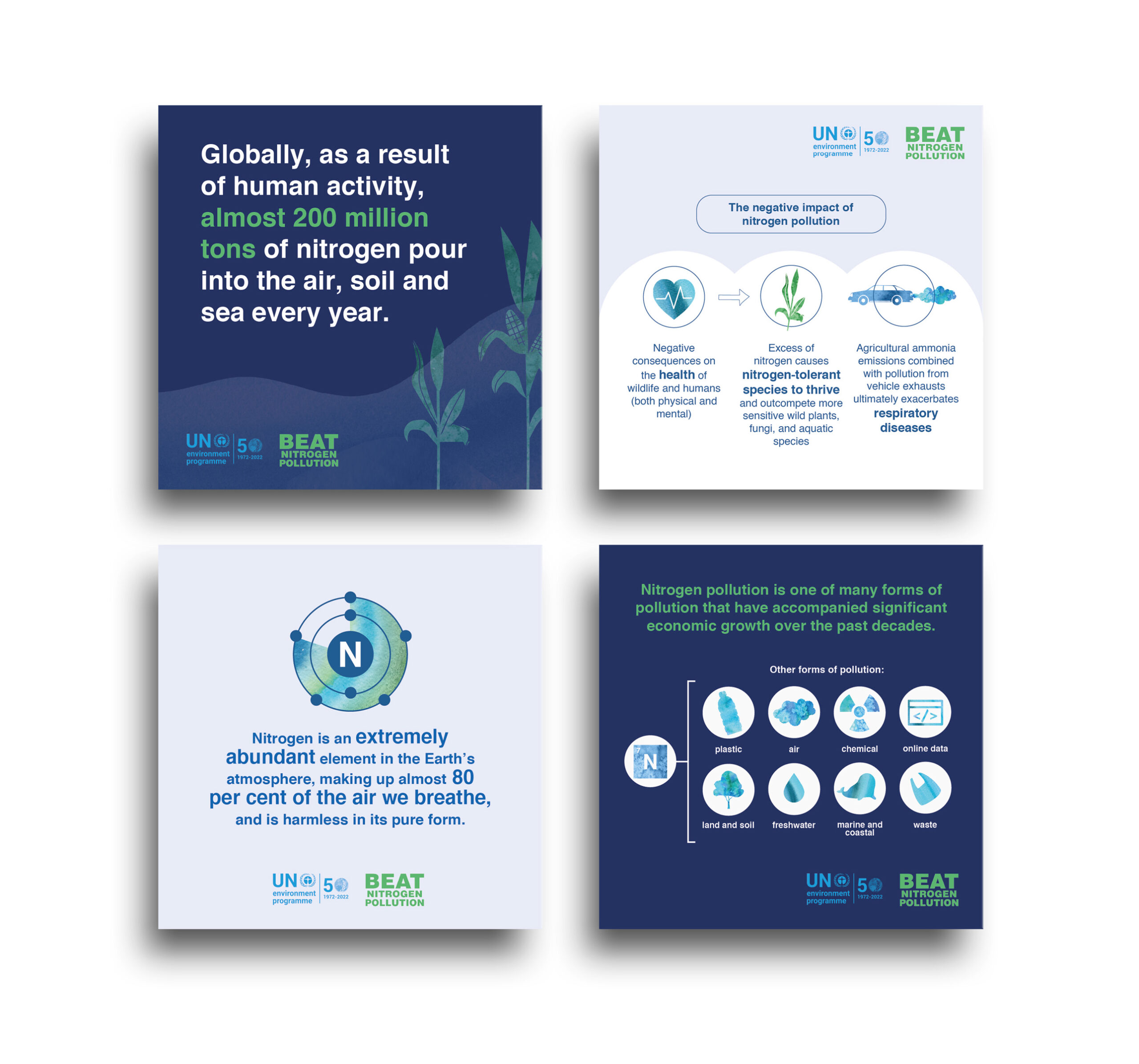
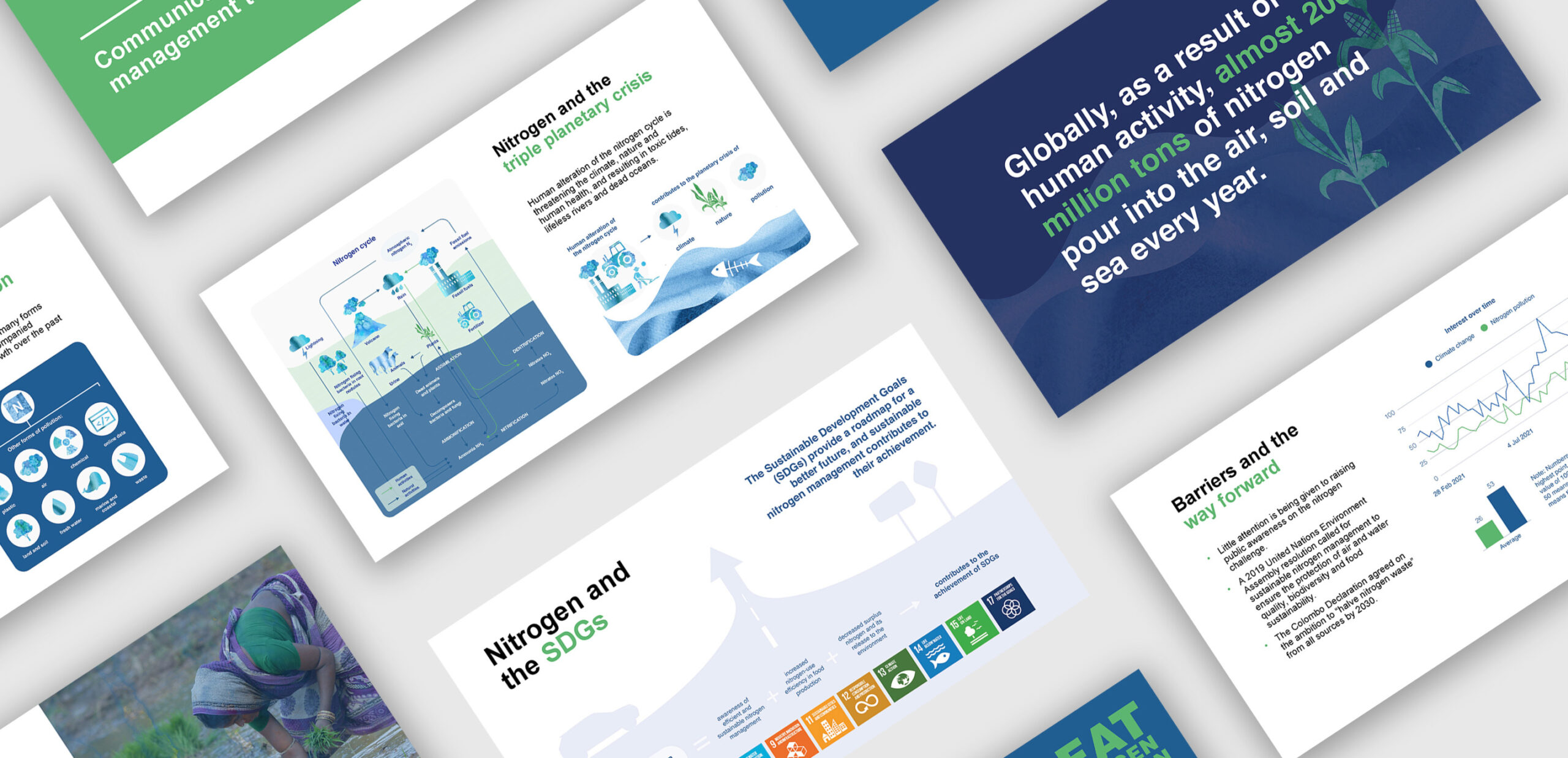
UNDP’s BEAT Nitrogen Pollution

Clear infographics simplified complex data and helped spread awareness about sustainable nitrogen management.

UNEP: Sea Circular 

We created infographics to better visualise the data and encourage enabling policies to prevent plastic pollution.

Contact us to find out how we can help you tell great stories with your data.

RECENT

WORK

SEforALL

A new lifeline for rural Madagascar

UNDRR

#GetToHighGround

Safe Online

A new direction

UNFPA

Women - the voice of Africa

Stay in the loop

We’ll send you quarterly updates so you can see what we’re working on, what the future holds and how we’re shaping it.